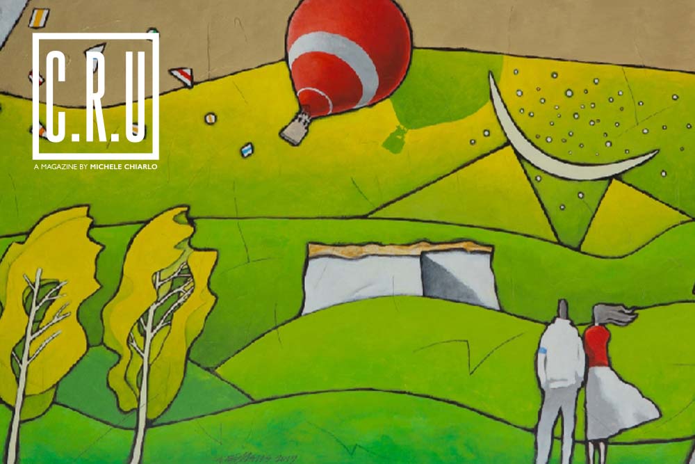
«Painting the Face of Wine»: Giancarlo Ferraris On Art, Inspiration and Commissions
Since meeting Michele Chiarlo at an exhibition in the 1980s, Giancarlo Ferraris has never stopped depicting wine. He did so alongside Michele and his sons Alberto and Stefano Chiarlo, establishing a symbiotic relationship between wine and art. One that he refers to as a «stream of ideas in which it is hard to identify where the artist ends, and the winemaker begins».
Born in 1950, Ferraris is a painter, an illustrator, a graphic artist and an engraver. He has a close bond with the territory of Asti and has been making labels for Michele Chiarlo for 40 years. «I have shaped him with my work, and, in turn, he also shaped me» says Giancarlo. He designed the labels for Barolo Cerequio, Barolo Cannubi, Barbaresco Asili and Nizza Riserva La Court, which won the international award “Label of the Year” in 2000. He is the artist behind the blue label of Nizza Cipressi, a true iconic Michele Chiarlo wine. Giancarlo Ferraris is also the artistic director behind Art Park La Court. He called on Emanuele Luzzati, Balthasar Brennenstuhl, Marcello Mannuzza, Fabio Albino Cavanna, Peppino Campanella, Dedo Roggero Fossati, Ugo Nespolo and Chris Bangle. He collected and coordinated their work in a «Warholian Factory» where art and craftsmanship merged to create the first open-air museum among the vineyards of Monferrato.
How did you meet Michele Chiarlo?
It was the early 1980s, Michele came to one of my exhibits and asked to meet me. Back then, I was a novice painter who made large watercolor paintings. I was also an art teacher at the Liceo Artistico of Turin, where I lived. While talking, we discovered that we both came from the area of Asti: I was from Canelli while he was from Calamandrana. He immediately asked me to create the labels for his wines. I was struck by his open-mindedness, which he gained after travelling abroad, and his courage to embrace innovation. He wanted to drastically change the way of depicting wine, leaving tradition behind.
What kind of labels were made back then?
The labels had no soul and were all the same: they were made with yellow or off-white colored paper and the name of the wine was written in gothic or cursive. They featured family crests and had mud-green colored borders. Michele wanted a colorful label with a strong identity: one that reflects the wine’s quality and personality. Wine must be pleasant to drink, and its label must be a sight to behold: Michele wanted to showcase his wines through their labels. I was struck by his modern ideas and took on his challenge. Together, we became the “battering ram” that knocked the wall of the worn out iconographic tradition.
Inspiration and Commissions: how do these two elements interact with each other?
This is a very delicate matter. Until then, my paintings only had to please – or displease – the audience. But now, another mind was entering my creative process and directing me towards a specific result. I was lucky because Michele Chiarlo – and his sons – possessed an authentic desire for beauty. The Chiarlo family firmly believed in their wine, and they have always valued my work. Commissioned work never felt like a burden, but more like a trail to be followed to the end: a tiring and exhausting process. Sometimes, my meetings with Michele gave birth to an endless stream of ideas. But in the end, the final result included all points of view, and this greatly satisfied us.
If wine is a form of art, what can art add to wine?
As I have written in my book “Il segno dei filari arancioni” (which includes most of the labels made for Chiarlo, ed), my art helped «paint the face of wine». In other words, an additional artistic touch to a wine label – just like my experience with Chiarlo – bestows a coherent style to an entire line. The sketches and colors endow the labels with a scenic design. Art reveals a mysterious inner reality, just like how a face manifests the emotions one may feel inside. We can say that art increases a wine’s charisma and develops a greater sense of “confidence” for those who purchase it as well as the people who produce it. A label that truly embodies its producer is easier to “place” compared to a label with which he doesn’t identify.