Giancarlo Ferraris: “They’ll think we’re nuts!”
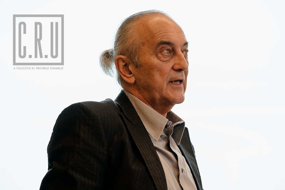
Born in 1950 in Marzano Oliveto (Asti), Giancarlo Ferraris is a painter, illustrator, graphic designer, engraver, and teacher. Since his debut in 1972, Ferraris has exhibited his works in solo and group exhibitions, earning a reputation for his mastery in watercolor, acrylic, and especially engraving, a medium he honed under the guidance of masters like Mario Calandri and at Piero Nebiolo’s print shop.
In addition to his artistic production, he has significantly contributed to the graphic and illustrative field, collaborating since 1975 with numerous magazines and shaping the visual identity of local authorities and consortia through public service posters. Among his most successful projects are the Wine Maps for Regione Piemonte in 1991, the book “Edenology” in 1992, and the award-winning labels at Vinitaly in Verona in the following years. His collaboration with Michele Chiarlo, which began in the 1980s through a meeting at an exhibition, marked a turning point in his artistic career, paving the way for a fruitful synergy between art and wine.
I first met Michele in the 80’s, during an exhibition where I was displaying my works. I still vividly recall that moment: I was a young painter, knee-deep in the art world, while Michele Chiarlo, approaching to meet me, was already a prominent figure in the wine industry. It was clear from the very first moment that there was something special about that connection, something that went beyond the mere courtesy of attending an art show.
Michele wanted to radically transform the way wine was presented to the world, and he had me in mind. At that time, I was collaborating with a magazine called Barolo&co, by Elio Archimede.
And so our artistic collaboration was born. Michele suggested I create the labels for his wines, an opportunity I eagerly accepted, inspired by his daring – almost too daring, for those times – openmindedness. It was an exciting challenge: we had to break with tradition and create something new, something that reflected not only the quality of the wine but also its unique personality.
Today, having eye-catching, creative labels is the order of the day; but back in the 80s, it was not like that at all – the world of agriculture was a sluggish elephant! Labels were all the same, inspired by those of French chateaux: off-white, with a classic cursive, maybe an image, mostly oval, of the estate.
Michele wasn’t having any of it; he longed to shake things up, and he didn’t care who opposed him. He said he wanted the bottles lined up on the shelves to be like artworks in a gallery, to convey emotions and arouse curiosity in the consumer. He wanted a wine bottle to be a pleasure for the eyes, as well as the anticipation of a pleasure for the palate.
I was young and fresh to the wine world, unbound by rules, full of inspiration: in my mind and my palette, I had Fauvism, Matisse.
It was like throwing a huge rock into a pond: we stirred up waves, disrupting the flat calm in which Italian producers had long sailed. I used to tell him – “They’ll think we’re nuts!”
This revolution, of course, wasn’t embraced by everyone, at least not right away: but Michele had the remarkable gift of not paying heed to negative comments, especially if they lacked substance and were only products of inertia. He was a worldly man, drawing inspiration and validation from beyond the mental and geographical confines of his surroundings: he knew that even in Italy, everyone would eventually understand, and he confidently continued to follow his intuition.
We had a blast experimenting with the labels over the years – colors and designs, but also foils, reliefs, embossing: we explored, with freedom and curiosity, every possible means to captivate the eye of someone holding a bottle of Michele Chiarlo wine.
Our creative process was intense and thrilling. We met often, discussed ideas and visions, and let our minds intertwine in a burst of inspiration and revolution. In the end, the result always exceeded our expectations: seeing my artworks transform into labels for Michele’s wines was always a satisfaction that’s hard to put into words.
Together, we brought to life ambitious projects like the Art Park La Court, an open-air museum among the vineyards of Monferrato, a sort of “Warholian Factory” where the union of art and craftsmanship, to this day, create something truly out of the ordinary.
Looking back now, I’m grateful for the years spent alongside Michele and his sons Alberto and Stefano. Our collaboration was much more than just a partnership: it was an experience that enriched my life and shaped my artistic career in ways I could have never imagined. And even though Michele is no longer with us, his spirit and vision continue to inspire my work every day.